5 - 7 December 2024
-
Design December Hong Kong
-
5 - 7 December 2024 - Design December Hong Kong -


5 - 7 December 2024
MAISON&OBJET DESIGN FACTORY
@HONG KONG CONVENTION AND EXHIBITION CENTER
EXHIBITION DESIGNED BY STUDIO UCHRONIA
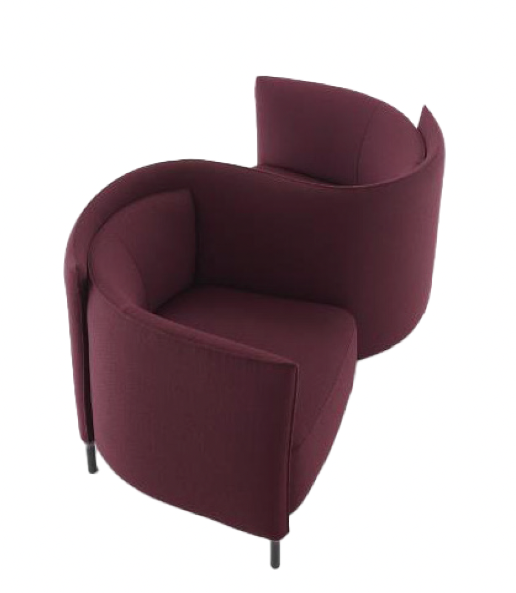
The exhibition highlights the key role of colour in furnishing, beyond its feel-good and energising effect. Like a clever colour chart, it explores the use of colour as an uplifting element in the various stages of creating, manufacturing and sustaining a brand or style. Colour turns into matter, telling the story of how materials are transformed. It highlights the entire history of furniture, drawing attention to the need for a sustainable future that incorporates the principles of eco-design and longevity. There are five main themes, highlighting around twenty pieces created by
French designers and architects, manufacturers and editors, all of whom are actively involved in eco-responsible practices or in promoting Made in France. These chairs, whether industrially produced or high-end, as well as self-edited pieces by designers, demonstrate a range of techniques and display the various means of expression of shades of colour. The ultra-pop, low-impact scenography by studio Uchronia adds the final touch to the range of approaches.
For nearly 45 years, Le FRENCH DESIGN, created by the French Ministry of Industry, has been imagining tomorrow’s French art of living for generations that are increasingly connected, nomadic and in search of meaning and emotion, but who must also be more frugal and eco-conscious.

COLOUR YOUR INDIVIDUALITY
The signature colour of a designer or a brand is a distinguishing feature expressing individuality and becoming a familiar reference point for consumers. Self-affirmation illustrated by the bright, contrasting tones that enhance shapes at Uchronia, the primary colours that go hand in hand with Jean-Charles de Castelbajac's instantly recognisable designs; the distinctly elegant shade of blue-green which is synonymous with the style of the talented Sarah Lavoine, and the colour that accentuates the compelling creativity of the studio Polcha. 'The range of colours is almost infinite - a blessing for adopting one as a signal, code, reference and/or signature. The colour then becomes the standard-bearer of the brand's identity which, through repeated use, becomes associated with it, so that it is no longer merely a decorative component. For this colour to stand out, it is all a question of nuance: the orange of Hermès is different from that of EasyJet, the blue of Decathlon is different from that of Lanvin....’*


CAPTIVATING COLOUR
The power of seduction takes on a whole new dimension with colour: it provokes, attracts, adds a sense of rhythm to the layout of a living room and sets the tone. Accomplice to inconsistent shapes, colour boldly embraces the upheaval of norms, as with Big-Game and Roche Bobois. It uncompromisingly expresses the distinctive lines of Duvivier Canapés. ‘A physical phenomenon resulting from the reflection of light on a surface, colour is also our first perception of an object, forming its 'flesh'. It has a visual impact, transmitting an immediate message. Colour is an active element that influences the senses and emotions. Mastering the language can help convey the 'right' emotions and thus guide consumer choice.’*


ARCHAEOLOGY OF COLOUR


Colour becomes matter, texture, telling the story of the transformation of materials, the evolution of techniques, industrial dexterity and the vital importance of recycling materials. It highlights the entire history of furniture, drawing attention to the need for a virtuous future for the furniture sector. Brands with a strong manifesto, such as Soca, Procédés Chénel, Maximum and Furniture for Good, have made it the hallmark of their responsible approach.
‘Materials of colour and colours of materials’: in the light of modern technologies that are removing the boundary between materiality and immateriality, colour has found its place in a newdimension. Dematerialised results, nuances in motion through expansion, diffusion, erosion ... Movement enriched by the attraction of polysensoriality: touch stimulates taste and smell, which stimulate the creative palette.’*

COLOURFUL PINNACLE
Colour creates value: it remains one of the secrets of long-term success. You need to know how to use it in the context of brand positioning and take full account of its heritage, and sociological and political value to help your brand mature, to allow it to grow and to ensure its longevity. Both Rinck and designer India Mahdavi, forerunners in the rich history of French decorative arts, have recognised and demonstrated this with talent that is acclaimed worldwide.. ‘Colour can be democratic or ennobled by designers, and evolves according to sociological, historical, economic and political criteria. Moving upmarket involves working within a specific context to choose a product that is consistent with the brand's positioning and image. Similarly, with a design product that is in keeping with the integrity of this brand image, while at the same time breaking away from norms to surprise and avoid being confined by social status.’*


NUANCING COLLECTIONS
This is a delicate art that is as much a matter of science as it is of the mysteries of taste and cultural inclinations. Theorised by Chevreul, Goethe and Johannes Itten at the Bauhaus, colour is expressed in carefully coordinated combinations to create a symphony that can be harmonious, disturbing, discreet or deliberately disturbing. Philippe Nigro, Fermob, Brichet Ziegler x Petite friture,Guillaume Delvigne and Margaux Keller demonstrate their mastery of the colour range, expressed with character.
‘From Chevreul to Goethe, theories of colour have been expressed through colour charts and harmonic concepts. Harmony calls upon the senses and orchestration, that subtle music that results from colours combined in scales that are pleasing to the eye. A colour chart orders, inspires and creates a pleasing balance of similar colours or coordinated tones on the colour wheel, for an attractive, coherent aesthetic. But harmony can also be unexpected, boldly disturbing, deliberately dissonant...!’*

* Olivier Guillemin and Dominique Cuvillier, president and vice-president of the French Color Committee.

DISCOVER THE INTERVIEWS
Maison Sarah Lavoine
Ligne roset
Moissonnier
MAXIMUM
DUVIVIER CANAPES
A scenography of colour: in the eyes of Univers Uchronia A ‘mirage of colours’ to understand the strategic lines of the exhibitioN
About Univers Uchronia
Uchronia is a multi-disciplinary collective rather than a traditional architectural practice, taking its name from a reflection on fictional time and the ephemeral. The studio creates modern 'experience spaces', breaking down the barriers between technology and creativity. It offers a full range of artistic services, from architecture and layout to design and visual identity. From restaurants and flats to fashion shows, the venues designed by Uchronia have a unique and contemporary identity.
For Chromo sapiens, Univers Uchronia has teamed up with Procédés Chénel to create a scenography made from paper and materials derived from sustainable sources.
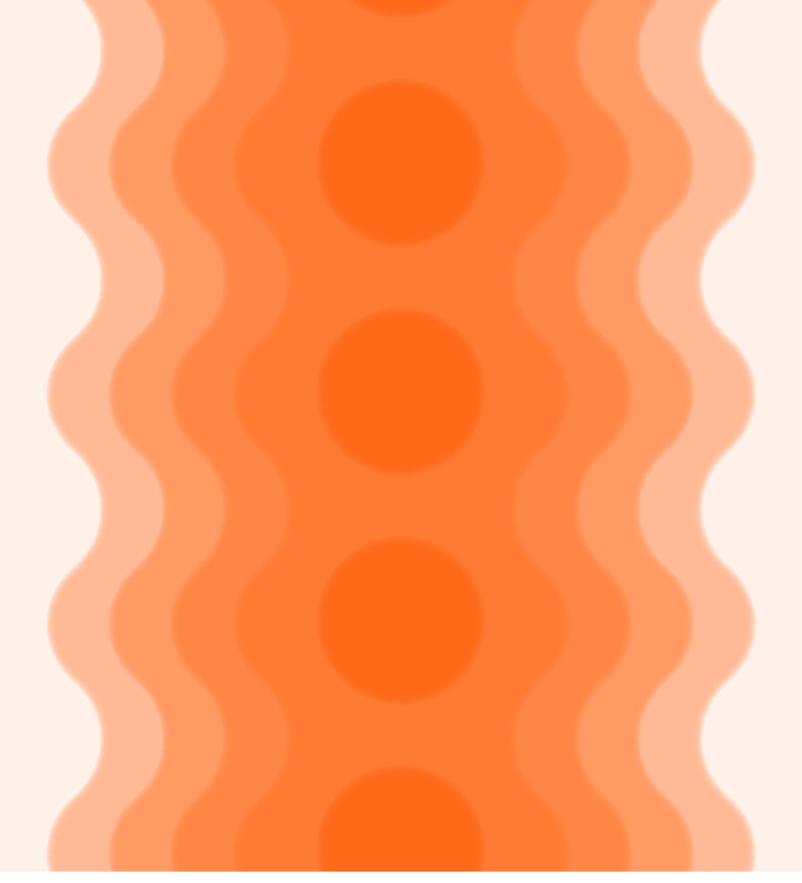
optical illusions
‘In a world where the boundaries between the virtual world and reality are blurred, we must rely on our intuition to fend off attempts to manipulate our senses. Our brains try to sort out what is real and what is not, as soon as they are confronted with an optical illusion: they are captivated, they stop to take a closer look and understand what is going on. Colour is used to accentuate this perception of optical games, leaving interpretation by visitors as an intellectual exercise.’Univers Uchronia
Psychology of colour
Theme 1 : Stand out, create a brand -> pink, the colour of boldness
Theme 2 : Attirer -> Attract -> red, the colour of sensuality, joy, passion and dynamism
Theme 3 : Innovate -> orange, the colour of creativity
Theme 4 : Create value -> violet, the colour of luxury, royalty and power
Theme 5 : Create a range, a collection -> blue, the colour of confidence and security
’To understand and follow the 5 key themes of the Chromo sapiens exhibition, visitors will be guided by a mirage of colours. Anyone who works with colour, whether an artist, architect, designer or fashion designer, needs to know about colour and its effects. Colour is much more than an optical phenomenon coupled with a technical device - it is the psychology of colour. Each colour refers to a symbol, an emotion, a meaning.’
PRESS
Juliette Vallet
Petite Couronne
+ 33 6 37 75 70 84
juliette@petitecouronne.com